
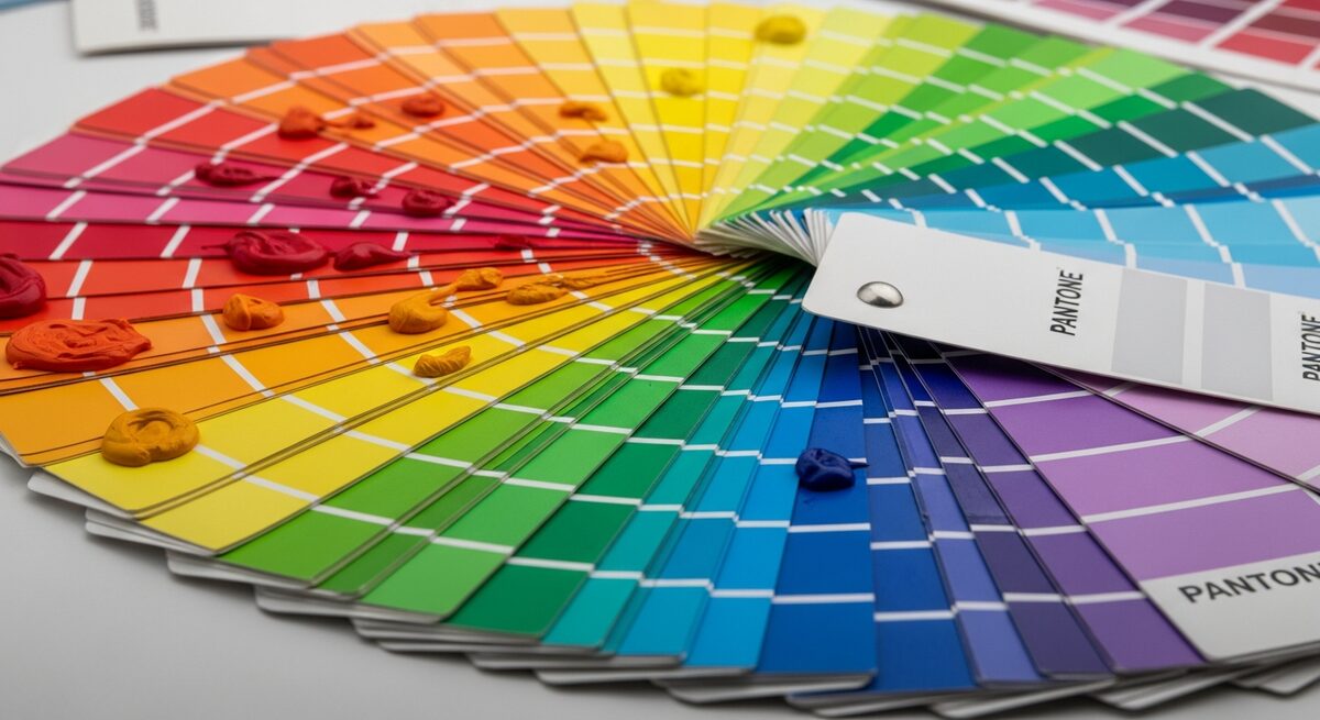
Long before someone reads your tagline, they feel your colours. The right palette sets a mood, signals your personality and makes your brand instantly recognisable across everything you make.
Start with personality, not preference
The best palettes come from asking how you want people to feel — energetic and bold, calm and trustworthy, premium and refined. Let that feeling guide the colours, rather than simply picking shades you personally like.
Build a system, not a single colour
A strong brand needs a primary colour, a couple of supporting tones and neutrals for text and backgrounds. Together they give you flexibility while keeping everything cohesive.
Test it in the real world
A colour that looks great on a screen can fail on a sign, a business card or a small mobile button. Always check contrast and legibility everywhere your brand will appear.
A simple palette checklist
- One confident primary colour
- Two to three supporting tones
- Reliable neutrals for text
- Strong contrast for accessibility
- Consistency across web, print and social
Colour done right becomes shorthand for your whole brand. Our design team builds palettes that look stunning and work flawlessly everywhere.