
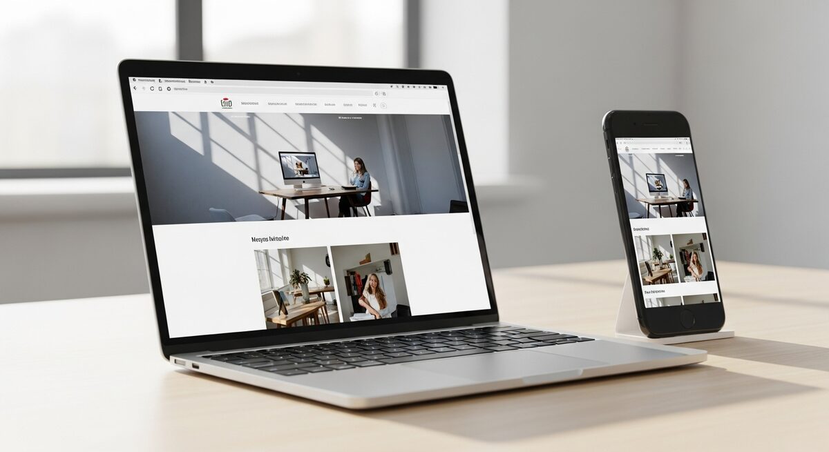
For most businesses, the majority of visitors now arrive on a phone. A site designed for desktop and squeezed onto mobile feels exactly like that — and it quietly costs you customers every day.
Mobile-first is how Google sees you
Search engines now rank your site based on its mobile version. If the mobile experience is slow or awkward, your rankings suffer even if the desktop site is beautiful.
Design for thumbs, not cursors
Mobile users tap, scroll and swipe. Buttons need to be big enough to hit, text large enough to read, and key actions reachable without pinching or zooming.
Speed matters even more on mobile
People on phones are often on the move and on slower connections. A fast-loading mobile site keeps them engaged; a slow one sends them straight to a competitor.
Mobile-first essentials
- Layouts that adapt to any screen
- Large, tappable buttons and links
- Readable text without zooming
- Fast load times on mobile data
- Forms that are easy to fill on a phone
A mobile-first site isn’t a nice-to-have — it’s where your customers already are. We build fast, beautiful sites that work flawlessly on every screen.